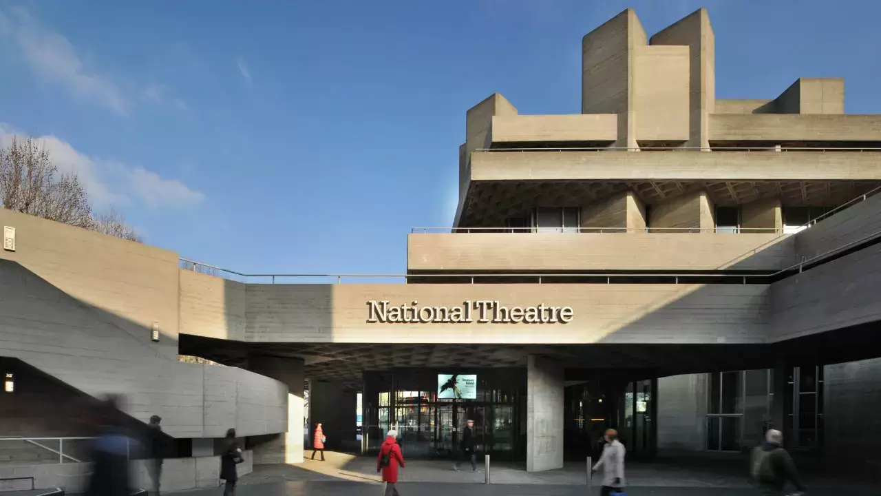
Brutalism
Brutalist architecture, which rose to prominence in the 1950s following World War II, represents a symbol of progress and transformation for postwar societies. These minimalist structures use raw, exposed materials, most often concrete, to communicate a streamlined, sustainable appearance. Beyond mere design, Brutalism displays a pragmatic solution to contemporary concerns, tackling urbanisation and infrastructural requirements with strong, efficient buildings. These structures, which serve as public areas such as government offices and educational institutions, help to promote civic identity and social growth. The movement's striking departure from traditional decoration symbolises a cultural revolution, demonstrating a new style and tenacity in the face of rebuilding. However, the legacy of Brutalism is not without controversy, as disputes for preservation show differing perspectives on its cultural significance. Nonetheless, the movement represents a period of resilience, flexibility, and architectural invention.
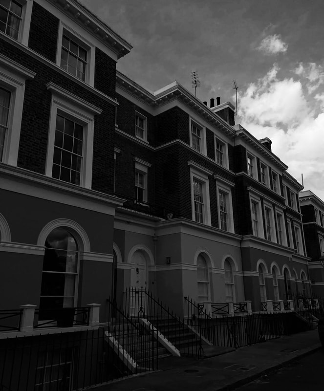
Simon Phipps-


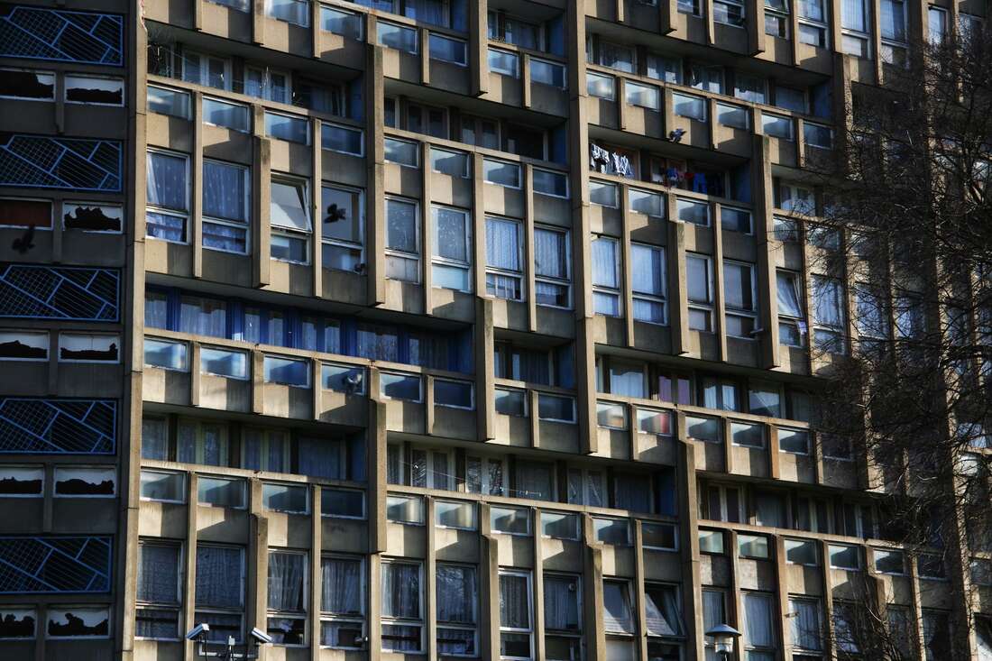
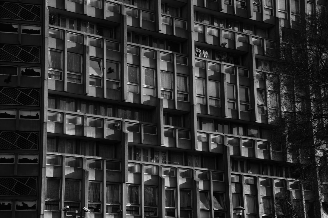
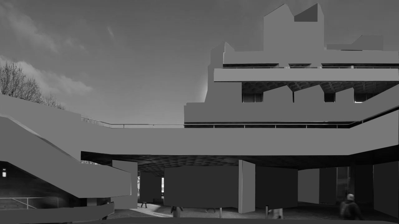
Simon Phipps' photography, particularly his delicate and detailed representations of brutalist architecture, demonstrates an intricate grasp of capturing the essence of these gigantic buildings. Phipps uses a simple landscape method to distil the complicated forms of brutalist architecture into visually appealing photographs. His decision to visit the actual locations reveals a dedication to authenticity, allowing him to portray the intricate details of each building's interaction with its environment. The following editing procedure, in which you use the brightness and contrast tools, reveals a deliberate attempt to highlight the architecture's underlying details. Decreasing brightness and boosting contrast can improve the play of light and shadow on rough surfaces, highlighting the raw, tactile about the nature of the concrete. The black and white tool enhances the visual impact by toning down the colours and emphasising the inherent contrasts in greyscale, resulting in a timeless and emotive look. This method not only emphasises architectural characteristics, but it also adds to the overall tone and setting of Phipps' work. The precise mix of fine craftsmanship and post-processing techniques resulted in a collection that not only archives brutalist architecture, but also makes it visually appealing and thought-provoking.

|

|
Thomas Danthony


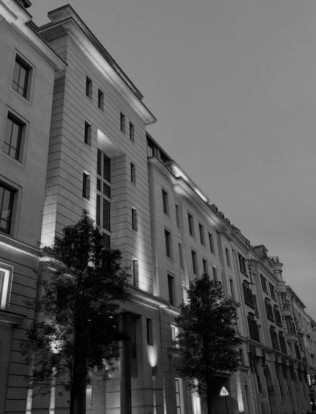
Thomas Danthony's method to recording and interpreting brutalist architecture gives a unique perspective to the study of this architectural style. His attention on London's main brutalist buildings implies a desire to capture the essence of the city's urban landscape as shaped by these structures. The subsequent change of his shots into reduced images in Photoshop demonstrates a planned artistic approach. This simplification may entail reducing intricate details to fundamental forms, resulting in a more abstract and subjective representation of the architecture. The use of screen printing highlights the creative quality of his work by giving a real and repeatable method for expressing his vision.
Following similar steps in Photoshop while replicating Danthony's method implies my deliberate effort to replicate the photographer's artistic choices. By reducing the photographs, changing brightness and contrast, and possibly converting to black and white, I aligned the approach with Danthony's creative vision. This technique requires not only technical skills, but also a thorough grasp of how these changes affect the visual story and emotional tone of the images. By following Danthony's lead, I hoped to distil the essence of brutalist architecture into a visually compelling and expressive portrayal, establishing a link with the artistic objective while also contributing my own interpretation to the larger conversation about this architectural style.
Following similar steps in Photoshop while replicating Danthony's method implies my deliberate effort to replicate the photographer's artistic choices. By reducing the photographs, changing brightness and contrast, and possibly converting to black and white, I aligned the approach with Danthony's creative vision. This technique requires not only technical skills, but also a thorough grasp of how these changes affect the visual story and emotional tone of the images. By following Danthony's lead, I hoped to distil the essence of brutalist architecture into a visually compelling and expressive portrayal, establishing a link with the artistic objective while also contributing my own interpretation to the larger conversation about this architectural style.
Thomas Kellner


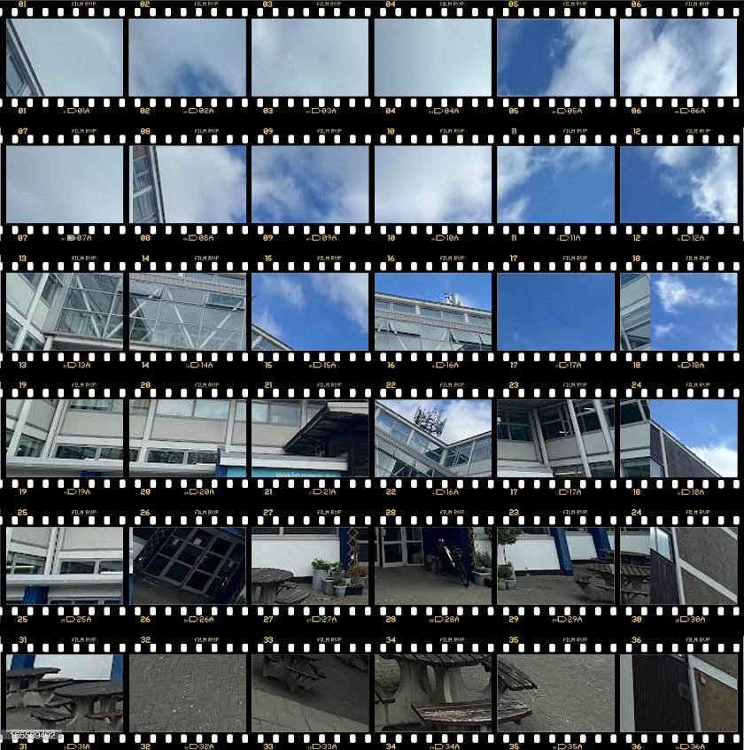
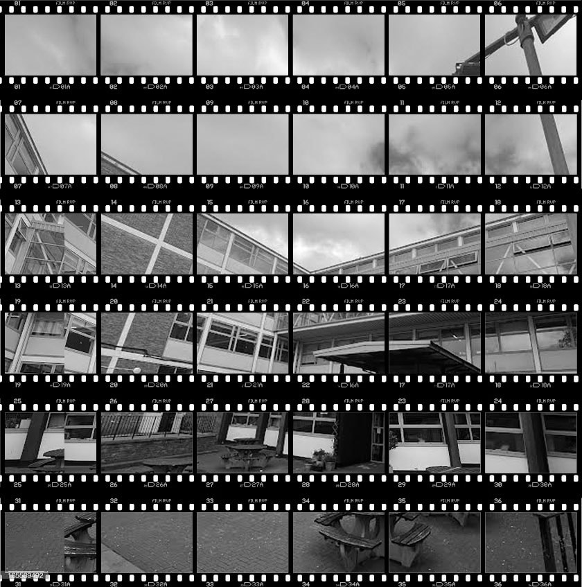
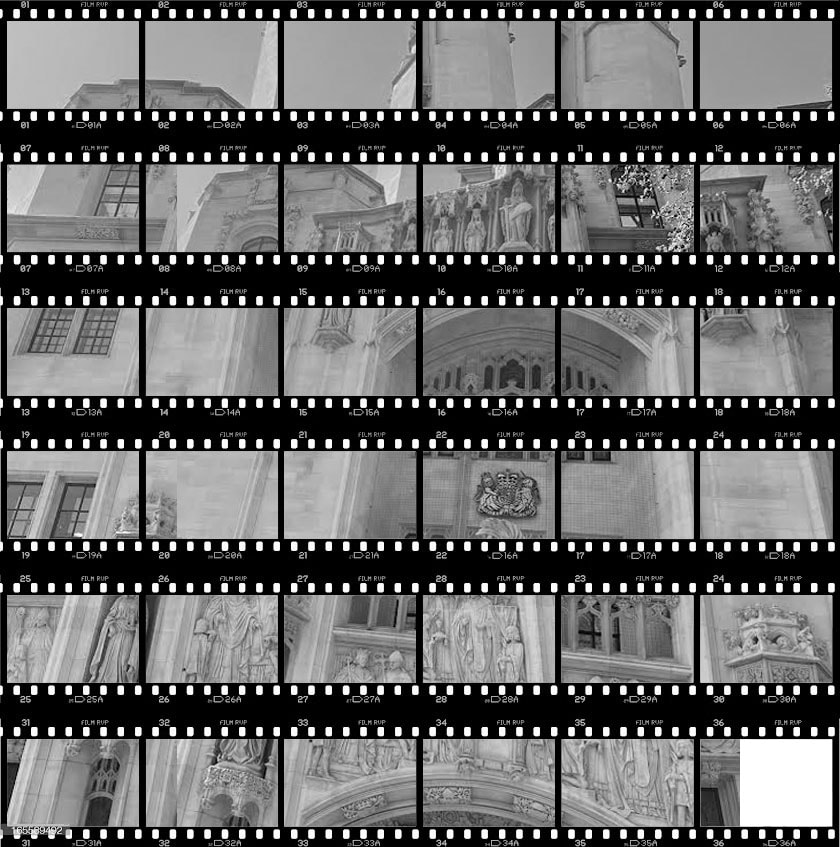
In my photography journey, influenced by Thomas Kellner, I found myself intrigued to the idea of deviating from traditional creative concepts. Taking inspiration from Kellner's experimental tactics, such as pinhole cameras and multi-perspective approaches, I began photographing my school from various angles while keeping the camera upright. When given a homework assignment to photograph outside structures, this led to a broader exploration, which included me going out to photograph the Supreme Court.
Kellner's approach encouraged me to take a multi-perspective approach, offering a new perspective on architectural forms beyond the usual viewpoints. Kellner frequently uses visual analytical composition in his work, therefore I experimented with post-processing and Photoshop alteration. I replicated his approaches by experimenting with collages, multiple exposures, and other editing tools to create a unique visual representation of the Supreme Court.
This method allowed me to contribute to the ongoing study about redefining art while also challenging established concepts of fine art photography. Focusing on industrial architecture and historic landmarks like the Supreme Court provides a platform for an intriguing investigation of the connection between form, function, and creative expression, giving my own perspective to the visual narrative of these important buildings.


Danny Quirk


Following Danny Quirk's research of the 'dark' side of art, I attempted to capture the hidden layers beneath the surface of my peer's face in a similar manner. To accomplish this, I surrounded my model with white card and strategically placed studio lights to highlight minute details, mimicking Quirk's concentration on exploration.
During the creative process, I took photographs of my colleague using the white card arrangement and added an extra layer by having her hold a piece slightly over her chest, allowing studio light to bounce about and reflect on her face. The next stage was importing these photographs to Photoshop, where I found a skull photograph on a website and smoothly integrated it with the portraits. Like Quirk, I used the opacity tool to precisely regulate how much of the skull's features were overlayed on my peer's face.
This transforming process continued as I turned the piece to black and white, a choice of style similar to Quirk's. This procedure highlighted the clarity of the skull's characteristics on my peer's skin, resulting in a strong visual contrast. By using Quirk's technique and creative vision, I wanted to learn about the hidden intricacies within persons and the fascinating interplay between the seen and unseen in art.

|

|
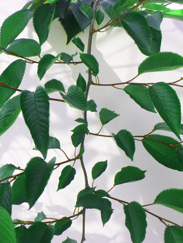
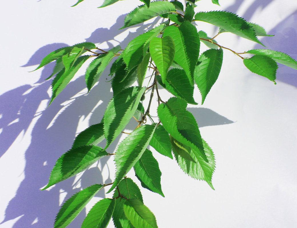
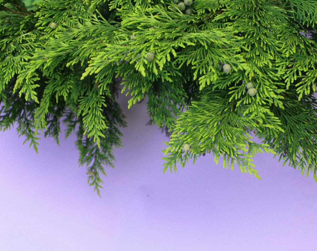
Myoung Ho Lee


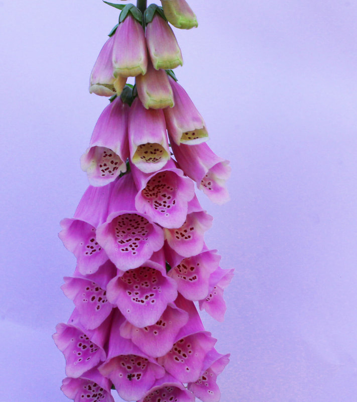
Starting this project inspired by Myoung Ho Lee's approach formed a turning point in my photography occupation, marking a move away from capturing the harsh beauty of brutalist structures and towards exploring the subtle patterns inside nature. Lee's emphasis on depth of field and seasonal changes inspired me to pursue a more sophisticated examination of the organic world.
In the restricted area available at my school, I used an entire A4 white card to isolate appealing elements of nature. This shift from the rigid lines and powerful shapes of brutalist architecture allowed me to focus on the finer details of leaves, patterns, and veins. The use of the white card not only framed the images, but also served as a tool to enhance the flow of sunlight, resulting in a compelling interplay of light and shadow that highlighted the natural beauty.
Capturing a sequence of photographs from various perspectives, some with shadows and others without, offered a depth of experimentation and discovery, matching Myoung Ho Lee's artistic course. Moving on to Photoshop's post-processing step, cropping and adjusting hue, saturation, brightness, and contrast became tools for highlighting the vivid details of the natural world, in keeping with Lee's careful approach to clarity and focus.
Moving outside the classroom, I broadened my exploration to garden centres, widening the variety of topics and adding new aspects to my photographic narrative. This shift from documenting man-made structures to the exquisite beauty found in nature was an important turning point for my photography page, demonstrating an expanded appreciation for the diversity and depth found in the biological world. The juxtaposition of these projects reflects my broad creative journey, ranging from the bold and brutal to the delicate and nuanced, and captures a sense of my changing photographic vision.


Before and after-


Strands-
The next stage in our structure part of photography is moving onto strands and singular developments. Overall this is the part of the course where we choose three artists we are interested in and continue to create developments of their work on our own and come to a conclusion with a final piece. In conclusion all these artists should slyly link together and all their work should primarily be based around structure. For my three strands I have chosen that they each focus on different parts of structure for example, nature, human body, and in the day.
Allen Klosowski- structure in the day


I chose Allen Klosowski as the final artist for my third photography strand because I admire his unique take on structures and architecture. Unlike some artists, Klosowski's work focuses on the often-overlooked characteristics of large structures, such as reflections, measurements, patterns, and tiny details. His careful attention to these details reveals a desire to reveal the variety and complexity inherent in architectural forms.
What really interests me about Klosowski's approach is his ability to tie his work to the larger concept of the environment. His images show structures not as independent entities, but as dynamic aspects that shape and influence the surroundings around them. Klosowski asks viewers to think about the intricate interaction between structures and their surroundings by experimenting with reflections and different angles.
One of the most intriguing parts of Klosowski's work is his deliberate depiction of structures in a way that allows viewers to interpret them subjectively. By presenting structures from various perspectives—reflected, from beneath, above, or straight ahead—he encourages us to interact with the images in a variety of ways. This method broadens his portfolio by emphasising that the perception of a building is subjective and based on the viewer's unique perspective.
In simple terms, I'm drawn to Klosowski's art because of its subtle simplicity and profound intricacy. By presenting structures in a new and different light, he challenges preconceived assumptions and inspires people, like myself, to appreciate the beauty and complexity of the built environment. His ability to transform what appears routine into a visual investigation of shape and structure is consistent with my increasing understanding of photography as a tool for capturing the essence of our environment.

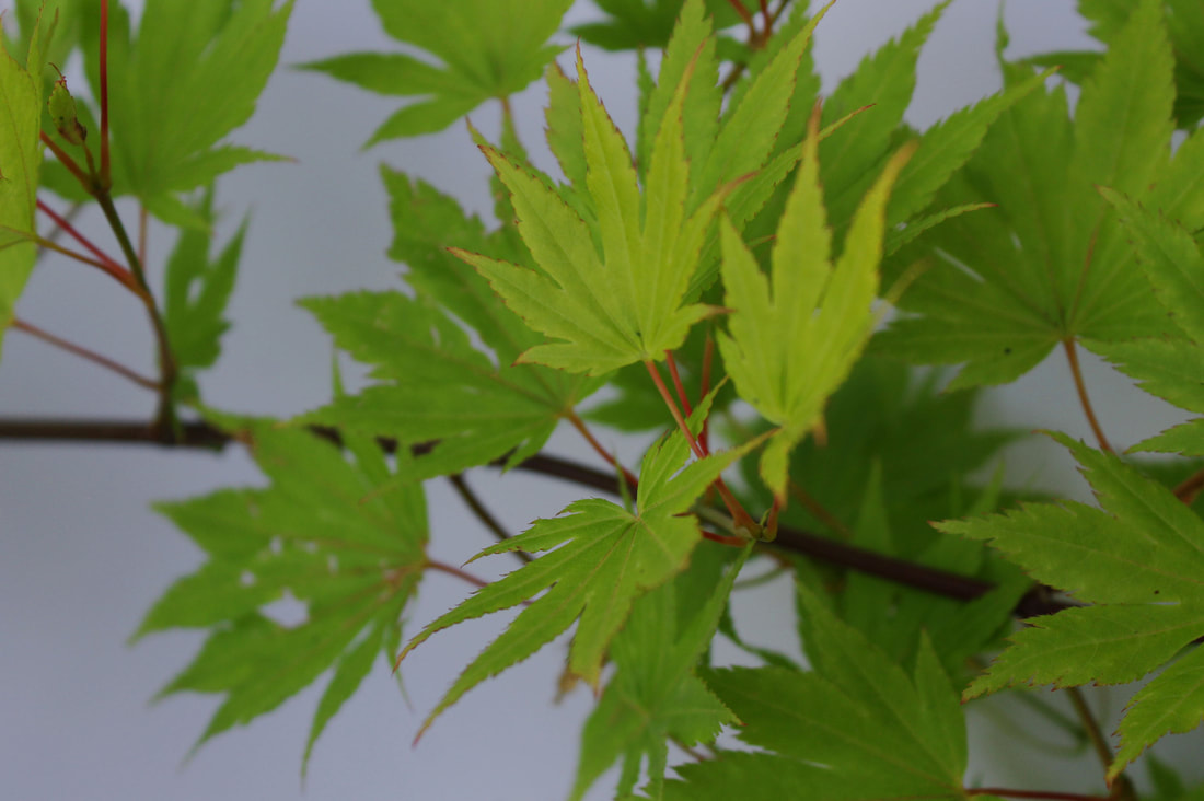
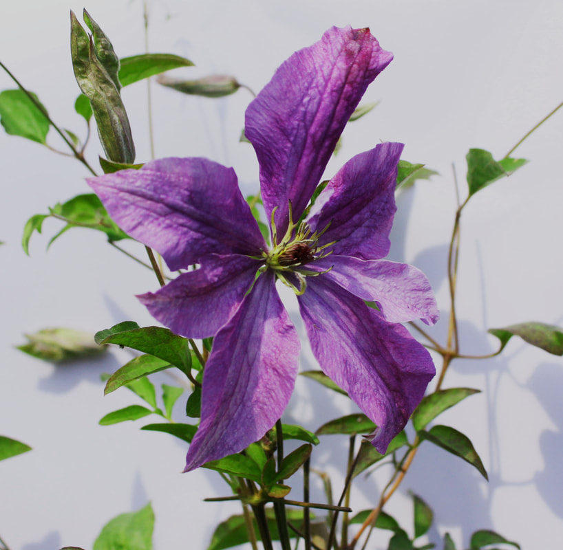
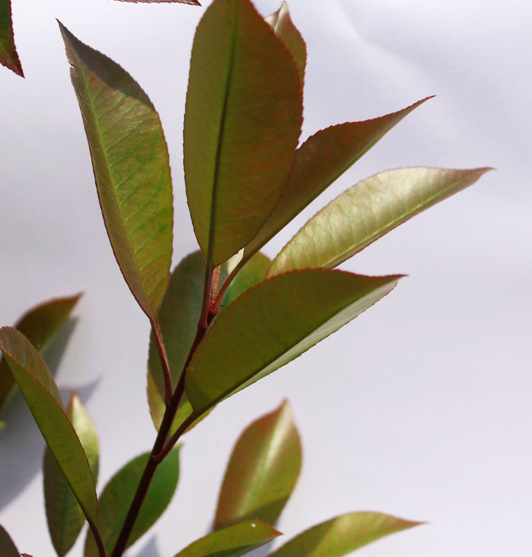
Jin lee- nature in structure


My interest with Jin Lee's work and the lovely interaction of nature and structure led me to choose him as an artist for this study. In his work 'Prairie,' Lee captures the subtle yet powerful events when nature collides with modern components such as houses, walls, and cars. The thorough documentation of plants and other fragments of nature that blend into urban environments over the course of a year provides a compelling narrative.
Lee's work is particularly appealing to me because of his attention on the contrasts between modernism and the subtle complexities of nature. The contrast between sturdy, imposing architecture and the innocence and fragility of flowers strikes a profound chord. It serves as a reminder that, no matter how large or imposing man-made structures are, nature's delicateness prevails and frequently wins.
Encouraged by Lee's approach, I decided to mimic it by visiting a garden centre. This direct involvement enabled me to discover and photograph the minute details of nature interacting with the more rigid aspects of man-made structures. Much like Lee's dedication to a long-term engagement with the environment, I sought to pay attention to minute aspects over time, mirroring his desire to capture the changing seasons and developments in the natural world.
In the garden centre, I was surrounded by the delicate beauty of flowers, plants, and other natural components set against man-made structures like pots, walls, and display structures. The experience not only confirmed Jin Lee's artistic vision, but it also expanded my knowledge of the complex dance between nature and society. It is a monument to nature's persistence and grace, demonstrating how delicate components can coexist and thrive in urban surroundings surrounded by concrete and steel constructions.


Development one
The second shot at the garden centre improved my accuracy and knowledge of Jin Lee's work. During the first shoot, I concentrated on capturing the subtle interplay between nature and man-made structures, but the second session allowed me to fine-tune and expand my observations.
For starters, my experience at the garden centre allowed me to become acquainted with the layout and numerous aspects accessible. This enabled me to approach the shot in a more targeted and educated manner. I was able to choose specific plants, flowers, and structures that closely reflected the locations photographed by Jin Lee, resulting in a more authentic reflection of his aesthetic.
Furthermore, the second shoot enabled me to expand on my first findings. I paid more attention to the garden's changing seasonal characteristics, seeing how different plants and blooms grew over time. This is consistent with Jin Lee's technique, in which he captures the transitions and developments in nature over the seasons. By revisiting the garden centre, I was able to better replicate this part of his work, resulting in a more full and realistic portrayal.
In addition, the second shoot allowed me to experiment with other angles, compositions, and lighting situations. Drawing inspiration from Jin Lee's meticulous recording, I attempted to represent the tiny nuances and contrasts in a more nuanced manner. This iterative process allowed me to refine my photographic style, ensuring that my photographs captured the delicate beauty of nature in a way that was consistent with Lee's work.
To summarise, the second shot at the garden centre provided a more realistic and nuanced representation of Jin Lee's approach. Familiarity with the place, a better grasp of seasonal changes, and the opportunity to develop my photographic skills all contributed to a more accurate representation of Lee's delicate combination of nature and structure.


Edited pictures
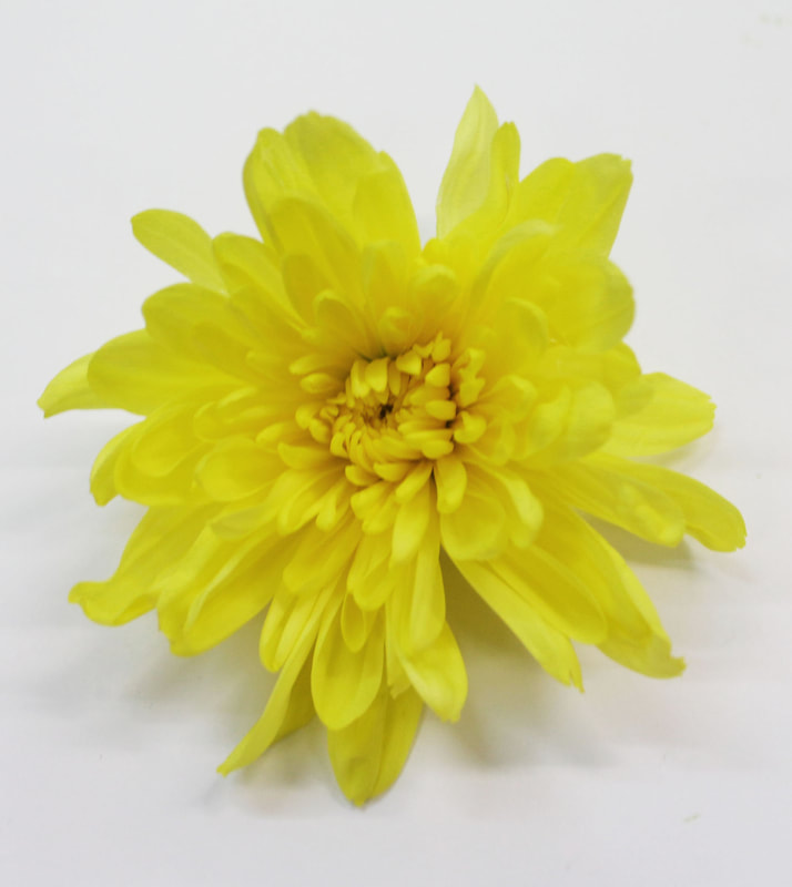
Development two-Karl Blossfeldt


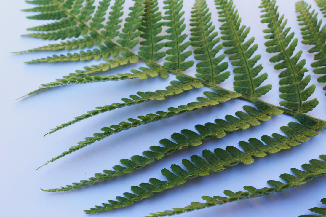
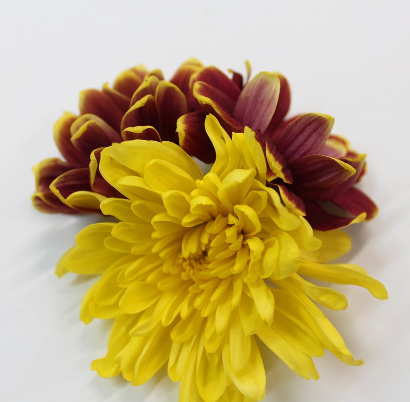
Karl Blossfeldt's technique of isolating flowers and nature by cutting them from their surroundings and setting them against a white background to capture minute details is fascinating. This technique enables him to delve deeply into the complex structures and distinct traits of each plant. This emphasis on isolating nature not only highlights each specimen's unique beauty, but also allows for a study of shape, texture, and detail.
In continuing with my thread of development, influenced by Blossfeldt's methods, I have also begun isolating nature to highlight the small intricacies within each plant. To create a minimalist backdrop, I carefully select attractive natural elements and arrange them on a white platform. This planned isolation is intended to highlight the intrinsic nuances, patterns, and textures that might otherwise go overlooked in a natural setting.
Once the images have been captured, I go on with the Photoshop editing process to improve the focus on detail. Like Karl Blossfeldt, I use the strong contrast of the white background to showcase the delicate details of the plants. Adjusting the brightness and contrast helps to refine the overall visual impression, bringing minor details to the forefront. In addition, I experiment with the clarity and sharpness tools to highlight the minute details, letting the viewer to see the intrinsic beauty of each individual plant.
In this investigation, the editing process becomes critical to capturing the core of Blossfeldt's approach in my own work. The goal is to maintain a balance between simplicity and depth, generating photographs that not only isolate nature but also inspire viewers to investigate and appreciate the often-overlooked intricacy of the world of plants.


Edited pictures-
Development three
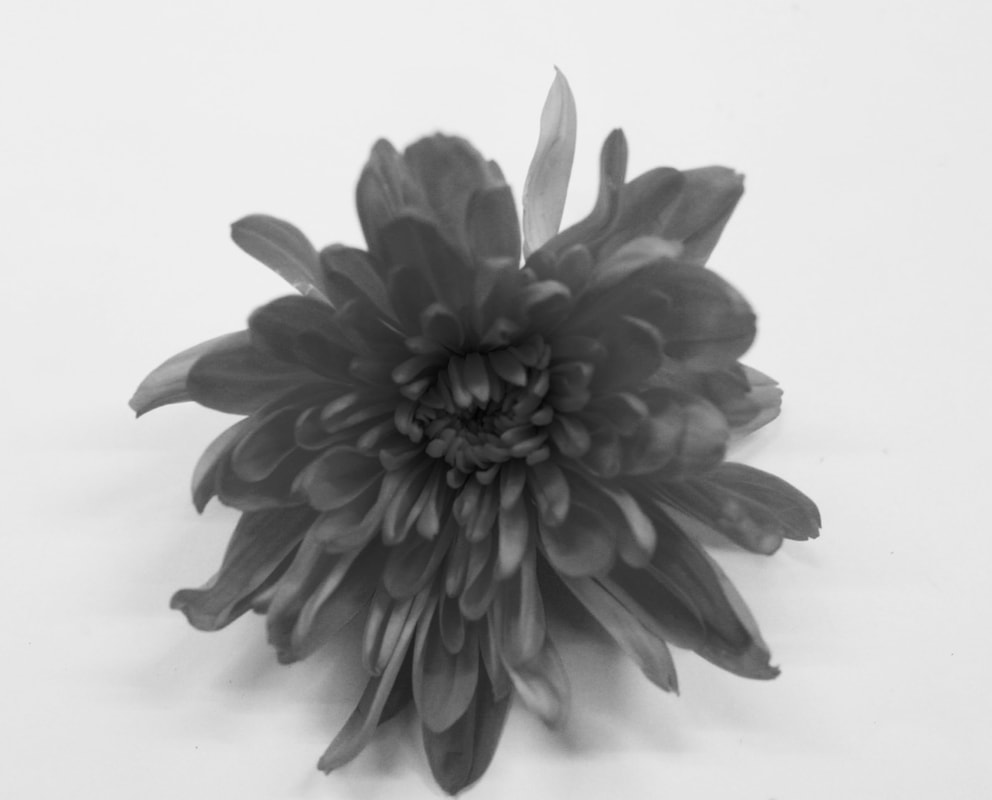
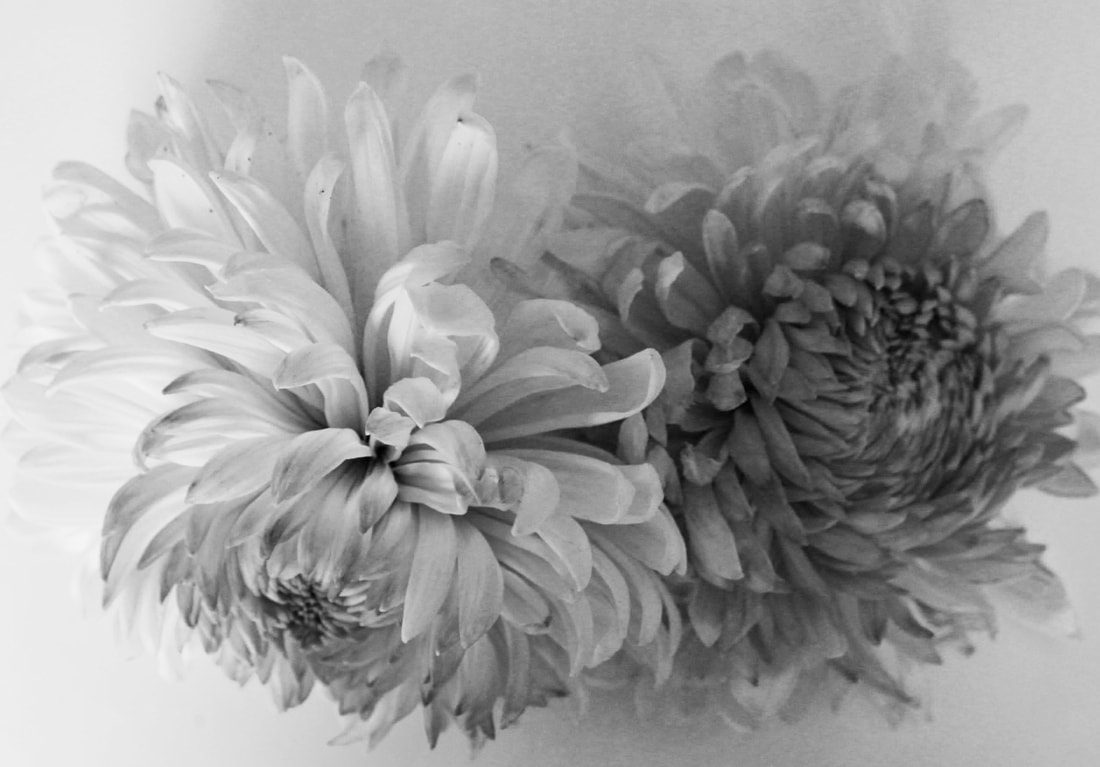
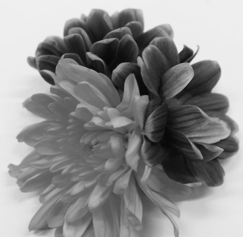
In my ongoing research of the strand, inspired by Jin Lee's solitude and Karl Blossfeldt's precise emphasis on nature, I added a twist by introducing a lack colour in my images. Unlike Blossfeldt, who primarily worked in colour, my approach was allowing the plants' brilliant colours to shine against the white background through them being in black and white. This deviation from the coloured approach into the monochromatic approach was intended to highlight the vast diversity and lovely characteristics of each individual object.
The decision to remove colour was purposeful in order to juxtapose Blossfeldt's precise colour editing. While his work is thoroughly focused on saturation and brightness, the lack of colour in my photographs was intended to enhance the intricacies and draw attention to the subtle variances within individual blooms. The monochromatic colour palette evolved as a way to focus on nature's intricate beauty, highlighting particular traits that would otherwise be overlooked in a colourful representation.
In nature, this shift in my technique, from colour, to black and white, provides spectators with an engaging experience. It enabled me to appreciate the vitality of nature when it is bathed in colour, while also enabling them to explore the timeless and classic look reminiscent of Karl Blossfeldt's groundbreaking work. This junction of two editing methods adds to the study of my exploration by displaying how a minor change in presentation can generate different feelings and highlight different features of the natural world.
Development four
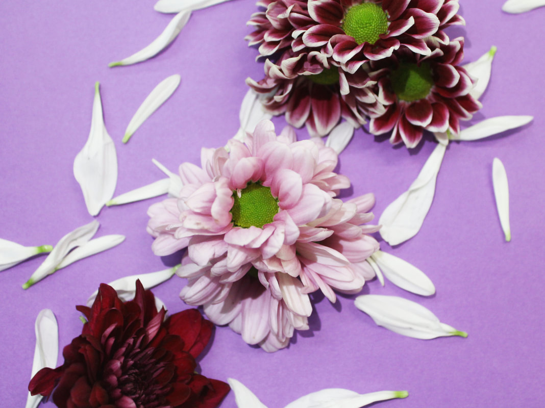
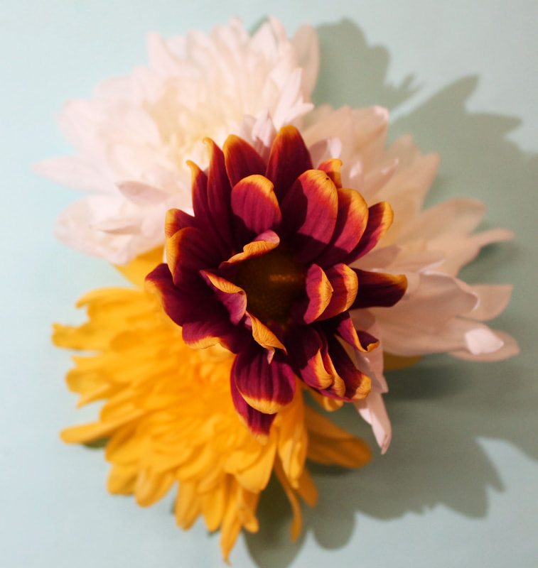
As the finale of my Karl Blossfeldt-inspired examination of nature's isolation, my final piece took a distinctive turn by integrating coloured card and colourful lighting. This approach differs from the typical black and white or simple contrast editing that Blossfeldt frequently used. Instead, I preferred a dynamic and visually appealing presentation by employing coloured backdrops and highlighting the individual flowers with coloured lighting.
Using coloured card as the base for the flowers provides a new level of visual interest and depth. The use of brilliant hues not only enhances the flowers' inherent colours, but also produces a balanced and visually appealing interaction. The coloured backdrops serve as a canvas, creating a contrasting backdrop that adds to the overall aesthetic appeal of each isolated flower. By strategically illuminating the flowers with different hues, I want to highlight distinct features, nuances, and textures. This method allows for a more subtle examination of the interaction of light and shadow, highlighting each flower's three-dimensional features. The coloured lighting not only reinforces the brilliance of the subjects, but it also helps to create a distinct and immersive mood within the images.
In this last stage, the use of coloured card and lighting provides a thorough examination of isolation strategies, demonstrating the diversity of ways within the larger topic. It also demonstrates my dedication to experimenting with new ways to express the delicate beauty and complex details found in nature. The use of vivid colours and coloured card as core materials not only honours Blossfeldt's painstaking isolation, but also lends a modern and dynamic twist to the timeless tradition of capturing the essence of individual flowers.


FINAL PIECES